|
|
Post by Rogobob77 on Aug 14, 2023 9:49:30 GMT -5
|
|
|
|
Post by ptctitan on Aug 14, 2023 11:10:17 GMT -5
Reads and sounds like the next step is to rebrand as the Midwestern Cities Conference.  |
|
|
|
Post by nctitan on Aug 14, 2023 23:31:25 GMT -5
The new logo, while a bit clever with the 11 -- the number of schools in the conference -- as the verticals in the H letter, looks an awful lot like the logo for the History Channel.
|
|
|
|
Post by titantarheel on Aug 15, 2023 9:29:19 GMT -5
I actually like it - I had come across the video on social before reading the announcement. I like the lean into being about the midwestern cities. Chance for us to grab onto some kind of identify while every other conference makes zero sense geographically or numerically. It shows the HL doing something and not just the treading water approach the HL/UDM has enjoyed for many years. Vid here --> www.instagram.com/reel/Cv7Qys7Aq8E/ |
|
|
|
Post by Commissioner on Aug 15, 2023 9:47:34 GMT -5
Surely two NCAA bids are not far off!
|
|
|
|
Post by JDetroitTitan on Aug 15, 2023 10:59:53 GMT -5
It looks like an eleven with a frown on it
|
|
|
|
Post by Rogobob77 on Aug 15, 2023 14:23:14 GMT -5
I do like the rebrand's emphasis on highlighting positive aspects of the primarily urban locations of member institutions:
"Major Cities highlights exposure to entities and experiences unique to major metro cities (professional sports, media, culture, arts, business) in the League's footprint."
The original name of the conference was the Midwestern City Conference before it was renamed the Midwestern Collegiate Conference. The first logo featured a generic urban skyline.
|
|
|
|
Post by Rogobob77 on Aug 15, 2023 21:00:25 GMT -5
It looks like an eleven with a frown on it |
|
|
|
Post by JDetroitTitan on Aug 16, 2023 7:30:11 GMT -5
It looks like an eleven with a frown on it Spinal Tap must be the new rebranding company for the Horizon League. The only problem is we are all the way to eleven so were do we go from there if we need to turn up just a little more? |
|
|
|
Post by dtowntitan on Aug 16, 2023 8:00:59 GMT -5
I like the intentionality about what the vision is for the branding, the 4 concepts that were described make sense, and if embraced could make for nice branding opportunities. However, this particular mark at first glance resembles or at least brings to mind for me the History Channel logo.
I do wonder if this means that the logo on the courts will be changed to reflect this new branding identity.
|
|
|
|
Post by Rogobob77 on Aug 16, 2023 8:22:09 GMT -5
I like the intentionality about what the vision is for the branding, the 4 concepts that were described make sense, and if embraced could make for nice branding opportunities. However, this particular mark at first glance resembles or at least brings to mind for me the History Channel logo. I do wonder if this means that the logo on the courts will be changed to reflect this new branding identity. Guessing nothing will change on the court anytime soon. "The current primary Horizon League logo will continue to be used while the icon offers a modern extension of the brand." |
|
|
|
Post by titantarheel on Aug 17, 2023 18:16:18 GMT -5
The MAC is emerging as a darling of sorts on the football side of things. It’s the clear and away most compact geographic conference out there which gives it an identity of sorts. They also embrace some quirky things of MACtion that also separates them, week night games etc. The HL could do worse then to look to MAC football for inspiration
|
|
|
|
Post by motorcitysam on Aug 17, 2023 19:13:43 GMT -5
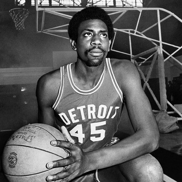
The MAC is emerging as a darling of sorts on the football side of things. It’s the clear and away most compact geographic conference out there which gives it an identity of sorts. They also embrace some quirky things of MACtion that also separates them, week night games etc. The HL could do worse then to look to MAC football for inspiration I agree with the points you and Rogo made above about the Midwestern City flavor of the conference. I think that should be something that the league emphasizes, which is why I never liked the change to the generic name "Horizon League". There was nothing wrong with the name Midwestern Cities Conference. In fact, it had something that the HL lacks: a sense of identity. The Horizon League sounds like a group of schools on the East or West coast. Still, I'd try to capitalize on the City aspect if I was at the league HQ. I'd run commercials celebrating "the City Game", featuring guys like Rashad Phillips talking about how the city basketball at St. Cecelia prepared him to excel in college basketball. I'm sure you've got similar stories that can be told from the perspective of Indianapolis, Youngstown, Cleveland, Pittsburgh, etc. Embrace it. It's basically the one thing all of our member schools have in common. |
|